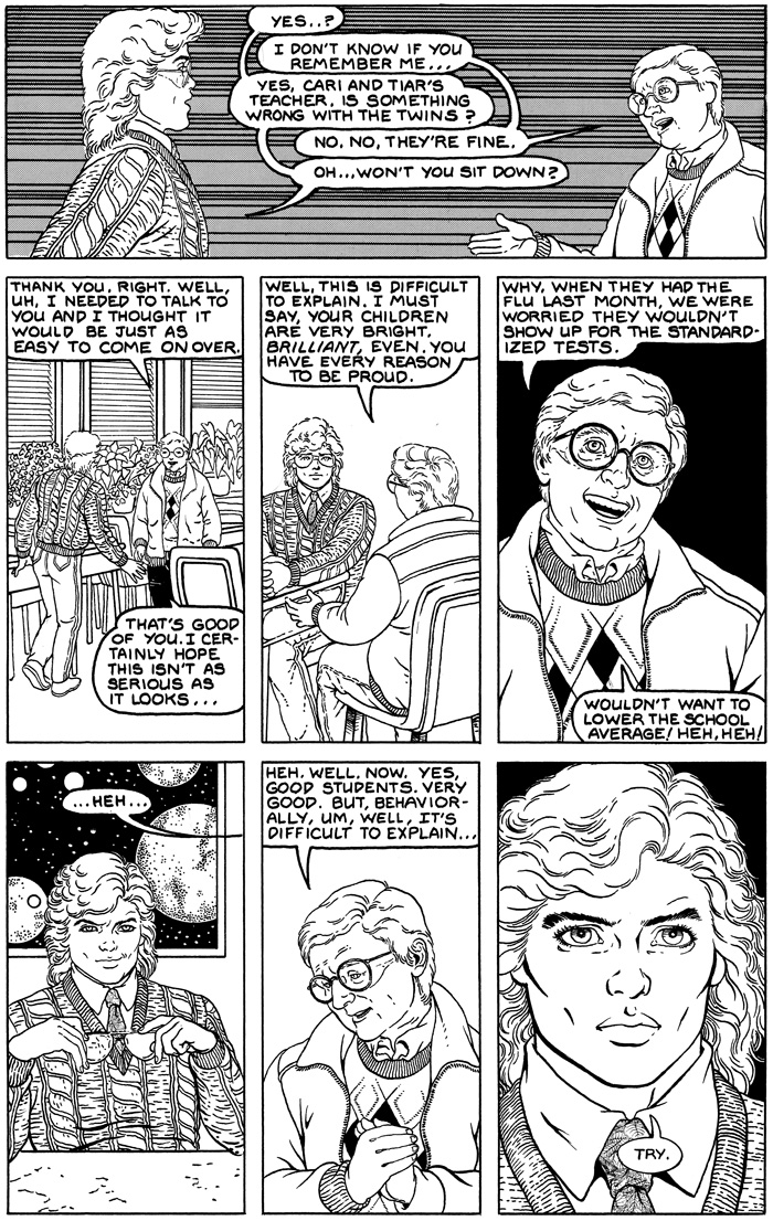
Aww! I was wondering when the tale of the Twins “weirdness” would crop up. Jason tells the Resistance all about the Twins being bonded and that even he thought they were strange 11-12 years in the future from when this is set. Then Jason talked about how he and Liana were bonded.
Aeren hasn’t seen Star Wars The Empire Strikes Back! No! Try not! Do or do not! There is no try! Of course given when this scene is set Empire Strikes Back might potentially not have been released yet. The sweater and tight jeans sort of indicate it has been out a few years though. Maybe having actually lived in a space opera means Aeren isn’t do eager to pay good money to be entertained by an EarthLink created one!
Never noticed the poster of the planets and stars behind Aeren. Lol sweaters never die…I don’t think they do. Something about 80s textiles made them both puffy and durable.
“Mr. Scott…. how can I say this? Your children are weird. Very weird. How is it that they can get perfect scores on standardized tests? Nobody gets perfect scores! And it’s not just the way they say things in unison. They upset their classmates, by… well, if I were fanciful, I’d say they were reading minds. But that can’t be…”
Just guessing of course. This story is ALL NEW to me! 😀
ok… I’ll bite… what do you mean by “ancient awful lettering”?
What I’m seeing looks fine to me. I love all the fonts we have access to now on computers, but I find myself missing the imperfect hand-lettered comics of yesteryear.
I made a lot of basic errors here, but they include things like word balloon shape and placement.
All of my current work is hand lettered, and I think it looks a lot better. My restored graphic novels include a font based on my hand lettering provided by Comicraft and all digital restoration by Allan Harvey.
The result is much cleaner and easier to read.
Someone was on twitter claiming the font was bad, which makes me happy because I do not want a technically perfect font. I want one that looks like my hand lettering. IMPERFECT. I know several people who purchased it and now use it in their pro work.
ok, I see where you’re coming from now. I was taking your comment too literally and thinking just about the words, not balloons and placement and other aspects.
I like what you’re talking about for the font based on your lettering. I used to toy with the idea of creating a font myself, I swear it used to be something you could do in Adobe Illustrator or maybe I’m thinking of Corel Draw… anyway, I thought it was possible to create/edit fonts but I keep being just lazy enough to not dig further into how to actually do it.
Stewart, there is software of some sort that will let you create special fonts now. (I’ve had this one bookmarked for some time, but haven’t budgetted for it, nor researched others, so it’s just a sample — http://www.fontlab.com/font-editor/typetool/ )
But I can see what bothers Colleen about this – the letter size is variable. Lettering can be tricky, even for artists. I learned that when I took an engineering drafting course one semester.
Sarah, Thanks.. I believe that or Fontographer were software packages I was trying to remember. I think I’m now remembering that while I could draw fonts in Corel Draw or Adobe Illustrator, I never had an actual font-editing program that would take those vector drawings and make a font from them.
I was in Electrical Engineering in college, so I had a drafting course too. I was already a fairly good printer, though. My father was a really talented artist and I picked up on trying to practice lettering at an early age. You wouldn’t know it to see me print on an average day, but when I’m trying to letter cleanly it’s fortunately one of those things that never gets too rusty. The balloon placement and spacing and design, though, as Colleen reminded me above… those are trickier and I probably never nailed that part down as well as making the actual letters.
At first I was confused, I was stupified…
thinking I could never see the errors you described.
But then I saw that Aeren’s sweater had a lot to say,
and it’s okay,
those sweaters really ruled the day!
18 Comments
Queen Ynci
Oh. Pooh. (WTF?)
RabidEwok
Aww! I was wondering when the tale of the Twins “weirdness” would crop up. Jason tells the Resistance all about the Twins being bonded and that even he thought they were strange 11-12 years in the future from when this is set. Then Jason talked about how he and Liana were bonded.
questionwriter
those 80s sweaterrrz….I remember…..sigh
Colleen Doran
I still have some of those sweaters! They never die.
StoryWriter
Dang sexy smirk! I love the sweaters!
Colleen Doran
It takes a lot of sexy to be sexy in that sweater.
RabidEwok
Aeren hasn’t seen Star Wars The Empire Strikes Back! No! Try not! Do or do not! There is no try! Of course given when this scene is set Empire Strikes Back might potentially not have been released yet. The sweater and tight jeans sort of indicate it has been out a few years though. Maybe having actually lived in a space opera means Aeren isn’t do eager to pay good money to be entertained by an EarthLink created one!
RabidEwok
Somehow, Cari and Tiar’s teacher stinks to high heaven to me like Dr. Martin from the Institute. Quick, Aeren! Pack up the kids and Jessica and run!
StoryWriter
Now that I’m over Aeren’s sexy, something indeed isn’t right about that teacher
RL
Never noticed the poster of the planets and stars behind Aeren. Lol sweaters never die…I don’t think they do. Something about 80s textiles made them both puffy and durable.
Sarah Beach
“Mr. Scott…. how can I say this? Your children are weird. Very weird. How is it that they can get perfect scores on standardized tests? Nobody gets perfect scores! And it’s not just the way they say things in unison. They upset their classmates, by… well, if I were fanciful, I’d say they were reading minds. But that can’t be…”
Just guessing of course. This story is ALL NEW to me! 😀
Loving it!
Stewart Vernon
ok… I’ll bite… what do you mean by “ancient awful lettering”?
What I’m seeing looks fine to me. I love all the fonts we have access to now on computers, but I find myself missing the imperfect hand-lettered comics of yesteryear.
Colleen Doran
Well, that is very generous of you.
I made a lot of basic errors here, but they include things like word balloon shape and placement.
All of my current work is hand lettered, and I think it looks a lot better. My restored graphic novels include a font based on my hand lettering provided by Comicraft and all digital restoration by Allan Harvey.
The result is much cleaner and easier to read.
Someone was on twitter claiming the font was bad, which makes me happy because I do not want a technically perfect font. I want one that looks like my hand lettering. IMPERFECT. I know several people who purchased it and now use it in their pro work.
Stewart Vernon
ok, I see where you’re coming from now. I was taking your comment too literally and thinking just about the words, not balloons and placement and other aspects.
I like what you’re talking about for the font based on your lettering. I used to toy with the idea of creating a font myself, I swear it used to be something you could do in Adobe Illustrator or maybe I’m thinking of Corel Draw… anyway, I thought it was possible to create/edit fonts but I keep being just lazy enough to not dig further into how to actually do it.
StoryWriter
It looks fine. I’ve seen worse and this isn’t bad. It looks fine
Sarah Beach
Stewart, there is software of some sort that will let you create special fonts now. (I’ve had this one bookmarked for some time, but haven’t budgetted for it, nor researched others, so it’s just a sample —
http://www.fontlab.com/font-editor/typetool/ )
But I can see what bothers Colleen about this – the letter size is variable. Lettering can be tricky, even for artists. I learned that when I took an engineering drafting course one semester.
Stewart Vernon
Sarah, Thanks.. I believe that or Fontographer were software packages I was trying to remember. I think I’m now remembering that while I could draw fonts in Corel Draw or Adobe Illustrator, I never had an actual font-editing program that would take those vector drawings and make a font from them.
I was in Electrical Engineering in college, so I had a drafting course too. I was already a fairly good printer, though. My father was a really talented artist and I picked up on trying to practice lettering at an early age. You wouldn’t know it to see me print on an average day, but when I’m trying to letter cleanly it’s fortunately one of those things that never gets too rusty. The balloon placement and spacing and design, though, as Colleen reminded me above… those are trickier and I probably never nailed that part down as well as making the actual letters.
questionwriter
At first I was confused, I was stupified…
thinking I could never see the errors you described.
But then I saw that Aeren’s sweater had a lot to say,
and it’s okay,
those sweaters really ruled the day!
….sorry….