A DISTANT SOIL: The Ascendant Chapter 4 Page 9
Most sincere thanks to Alejandro Valdes who tipped the hat jar and got himself a nifty Neil Gaiman signed book! Thank you so much and warmest wishes to you!
THANKS FOR READING! We’ll be back on Monday with M-F posts!

24 Comments
Colleen
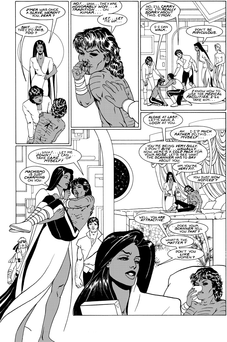
I think the transition between those middle panels is awkward. Might benefit from a caption to indicate change of place.
Laurie Sutton
I don’t think a caption is necessary. The change of scene is obvious. However, my eye went from panel three to panel five because the word balloon (“Alone at last.”) was anchored to the top of the panel. It was the first thing my eye went to after the last balloon in panel three. If the “Alone at last” balloon had been closer to the boundary between panel four and five, I would have read it the way you meant it.
Old editors never die, even when you wish they would.
Colleen
That’s true. I’d have to move all of the balloons in that shot to compensate, which would be a problem. I’d have to redraw the BG in that panel, which would have to be done digitally.
And don’t be silly! I really appreciate all the good advice I’ve had on the blog. 🙂
Laurie Sutton
O Hindsight, thy vision is 20/20!
Colleen
WAAHH! SO TRUE! It is maddening going through older work. I am working on a really long original GN for Vertigo right now and I draw a page which I don’t ink for six months, come back to it, and need to redraw it.
Carla Speed McNeil
How you resisted having a ‘grace note’ panel With the guys by themselves after Bast sweeps off with D’Mer in her arms, I just don’t know. But the change of scene is quite clear; any awkwardness you’re seeing probably comes from the fact that there is no pause in the conversational rhythm, no break before the second ‘verse’ begins.
Colleen
A reaction shot would hae been awesome.
Oh, God, you’re killing me!
WAAAHHHH!
amikael
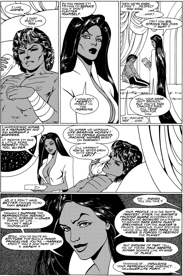
Extremely cute kid. Based on anyone real? Could I meet him?
Arlnee
Minette looks away, whistles… Galahad crosses himself…
yeah. Priceless XD
Colleen
WAAAHHHH! Golden opportunity down drain! I could add a page here, seriously.
@Amikael: Alas, D’mer is a figment of my imagination. And he’s 24, which made him an older man when I first drew him, and now I am a dirty old woman for lingering over his abs.
Arlnee
That was Minetti. my kingdom for an edit button!
Colleen
BTW, I created D’mer long before I saw this actor, but I later modeled him on a popular Japanese performer name Kyomoto Masaki.
mamid
I love the back and forth between Bast and D’mer here. Sort of a cat with a mouse not realizing the mouse is actually a wolverine.
Allan
The diminishing sizes of panels 1 to 3 left to right forces the eye up towards the top right hand corner and… off the page. If you look at this page “manga-style” — right to left — the panels read a lot smoother and draw the eye into the page.
And, yes, the big blank gutter between panels 4 and 5 stops the eye dead, a fault that even the overlapping Bast can’t compensate for.
The individual images are great, but only as individual images; when considering the page as a whole (Eisner’s “meta-panel), the storytelling doesn’t really work. But, y’know, it’s one page in, like, a thousand…
Colleen
Full agreement. Not every page is a winner. You can really see my bad days.
Laurie Sutton
Hindsight is the Bitch Goddess — she wants you to tweak everything.
amikael
And he’s 24..
—
Never tried a younger man? 😉
Colleen
Even if I did, I wouldn’t discuss in public. 🙂
Arlnee
a fault that even the overlapping Bast can’t compensate for.
Yeah, she overlaps all right… oh, wait XD
(I know, fish in a barrel… but someone had to say it, so may as well be me)
Colleen
BWAHAHAAA!
By the way, I say I appreciate the critiques, and I mean it. There may not be a whole lot I can do about the old stuff, but you never know when it will help the new stuff.
THANK YOU!
Arlnee
see that’s the difference between amateur/fanfic and a pro. A pro will get a technical critique and look at it and go, “yeah, you’re right” or “I can see what you mean but it works for me” without assuming it’s personal.
An amateur/fan work will get a technical critique like, oh, a misplaced apostrophe, and for the next week the topic will be WAAAAHH YOUR ALL MEEEENIES IM LEAVING THE INTERNET FOREVER!!!!11!
Mistakes will be made, that’s kind of a given. What you do about them and how you respond to them is the dividing line.
Colleen
That’s really nice of you to say.
I appreciate a critique. I want to be a better artist. If someone is right, they are right.
Sometimes the critiques are just way off.
I remember someone going on about how my figure work on Orbiter was over-rendered. And I thought, whoa, there is someone who hasn’t a clue what they are saying because that works was very simply rendered. Flat blacks and simple line. No rendering. So, I completely dismissed their comment.
It would be correct to criticize some of the early A Distant Soil figure work as over-rendered.
I originally made the art fairly simple, because I intended it for color. Later I redid the art for black and white and added a lot of hatching. And I went overboard. It shows how insecure I was about my drawing.
I think it’s great that people take the time to let me know what they think. They could just ignore it. Their time is as valuable as mine.
That said, you have to be able to filter. If someone says they hate my work because it’s too full of pretty people and it’s in the 1980’s, and there are gay people in it, well, that’s not a useful critique. It’s like complaining that an 1830 romance novel has too many pretty people in it, and it’s too old fashioned. Dude, go read something else.
But storytelling points, and grammar, and character motivation, that I can use. If I can’t go back and redo what I have done, I can learn from the mistakes.
Colleen Doran
UPDATED
Jeremy_A
Wonderful page!