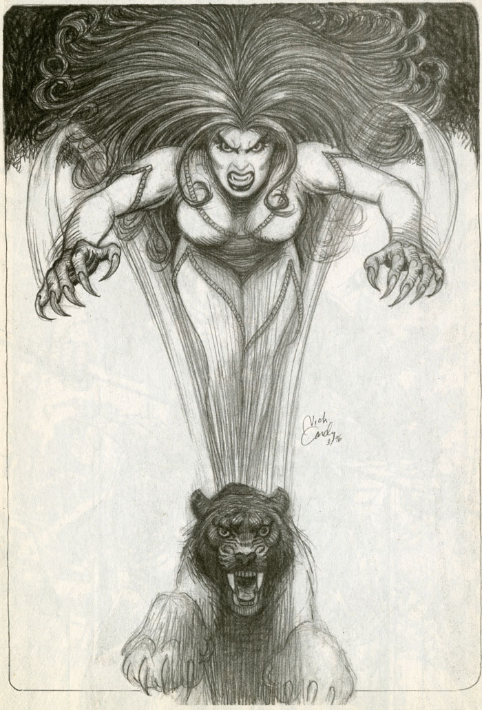
BAST by Nick Cardy
Legendary comic artist Nick Cardy, co-creator of The Teen Titans, did this wonderful pencil drawing of Bast for a collection of A DISTANT SOIL pinups, and you can imagine how excited I was! Not only was he one of my favorite artists growing up, he was one of the kindest, most gentlemanly men in comics. It is a highlight of my career to have had him as a friend.
While I do have the original negatives for this in storage, this is scanned from a copy, and isn’t as clear as it should be. I am afraid to go digging through my archives to pull out the negatives. They are delicate and I’d rather scan them all at once, if I can. That is going to be a task, let me tell you.
I don’t have most of the negatives from the series, but I do have the negatives of this book of pinups. The negatives are of far lower quality than art scanned from the originals, but in some cases, such as with these pinups, the originals are not available.
For the restoration of the art for the graphic novel series, while we were able to acquire a small number of negatives, we found them to be of such poor quality compared to what we can do now, we decided not to use any of them. Instead we took the time and expense to either track down all the original art, or redo it digitally. It is virtually impossible to tell which pages were shot from originals, and which were restored. Even I can’t tell, and I drew the book.
Volume I required quite a lot of work, but Volume II was a little less cumbersome.
The latter three volumes of the series will be shot entirely from original art, or with no more than a handful of restorations required. Allan Harvey, who is doing the lion’s share of the work, is on Volume III now. I’m very nervous about diving back into it all!

9 Comments
Stampers Saverem
*Yowsa!*
Don’ mess with this Kitty!
Colleen Doran
I love this piece!
Stewart Vernon
This is pretty awesome. Also cool when someone you admire does a thing based on something of yours!
Colleen Doran
It really is, never expected it.
Stewart Vernon
On the subject of restorations… How do you decide what to fix and what to keep for nostalgia? I’m not accusing you of George-Lucasing your work! 🙂 I ask for myself for legitimate reasons. I’ve been doing a Web comic for a while, and it was rough in the beginning. I changed lettering fonts after a few months, and tweaked some of the character designs too. I’ve been running for nearly 2 years now, and am considering collecting some of them into comics or a TPB… but every time I look at them, I wonder if I should collect them “as is” only fixing unintentional glitches like a stray line, missing line, or typo in the text… OR if I should update the earliest ones to match more the way I’m doing it now. It’s a hard decision, and my stuff is not nearly as complicated or detailed as your work.
Colleen Doran
We’ve made very few changes in the art. I can think of, maybe, five panels where we swapped tone sheets for something better. Otherwise, the art is left exactly as is. I did not redraw anything unless I found a genuine continuity mistake. And I didn’t find many.
In a few cases I added pages I could not add before. For example, there is now a major double page spread in Volume I that wasn’t there before, for the simple reason that I had no idea how to add a double page spread to a book without screwing it up when I was self publishing, as embarrassing as that is to admit all these years later!
Lettering on Volume I and part of Volume II was redone. There was a different letterer doing the work on the original series. But like many letterers he wanted royalties and a raise, and I can’t blame him. But we really couldn’t afford it. So I decided to do the lettering myself.
My early lettering was just terrible. So, when restoring the project, we decided to replace all work by the original letterer as well as to replace all my early lettering with a font based on my hand drawn lettering created by Comicraft just for this project. Allan Harvey did all the restored lettering.
It makes a huge difference in the readability and continuity of the work.
I know several people who have made big changes in their early work, and I gotta tell ya, it was tempting. I have always regretted the inking style I used on pages 60-180 of A DISTANT SOIL, as I succumbed to pressure to harden up the look of my art since I kept getting ribbed for being too “feminine”. Big mistake. Those pages are the only page from the entire series that really bother me. But I’m stuck with them.
If I won the lottery, I might redo them, but I doubt that will happen! And if so, we’d be getting a color edition!
Stewart Vernon
Thanks for all of that detail! I really appreciate it. I remember you previously posting about your personal lettering font before. I’m not doing that, but I do have a better font now than I originally did, so that really jumps out at me when I look back at early stuff I’ve done. That’s probably the most glaring difference I feel like I ought to fix… along with a few unintentional typos and a handful of crossbar “I” characters that slipped through where they shouldn’t. I also have a few panels where I forgot to carry over a background thing that should still have been visible.
I think maybe you’ve helped me decide, though, that I really should fix the lettering for the best and most consistent presentation… and fix the unintended gaffes… but leave the character designs as-is and people can see how I evolved over the course of time.
I’m pretty much doing everything in Adobe Illustrator, and the plan is to make backup copies and update those while keeping the originals… so if I am ever famous 🙂 I’ll be able to go back and talk about the originals versus the changes I made later.
Thanks for all the insight you gave me here, it was very helpful.
Carol
Would it take a lottery for a colour edition? Could we kickstart a colour edition? 😎
Colleen Doran
🙂 Maybe someday, but it would definitely take a lot of money!