MERRY CHRISTMAS! NEW!
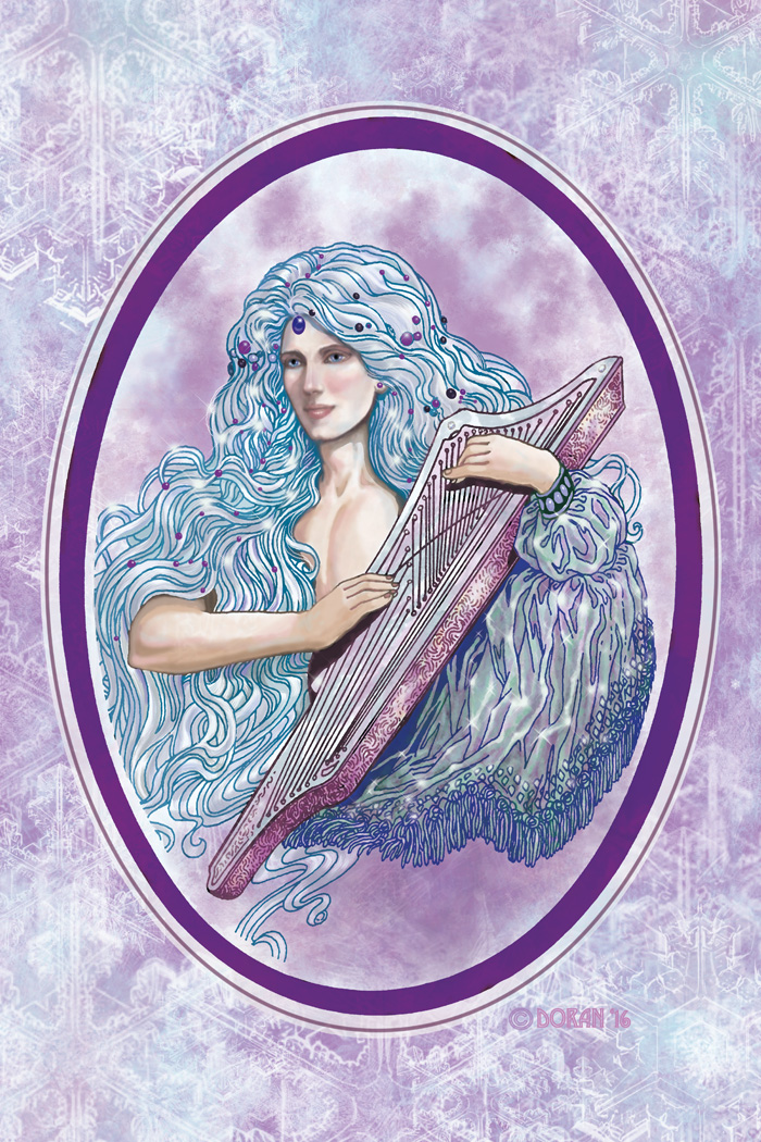
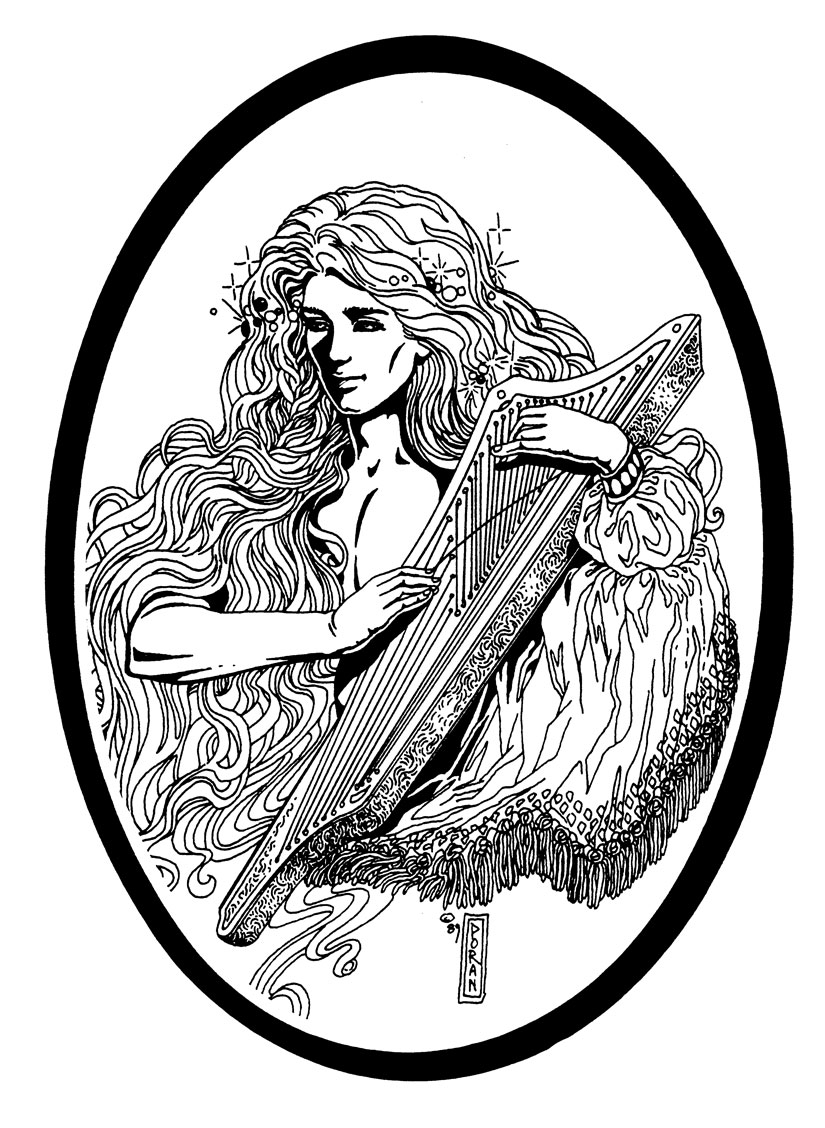
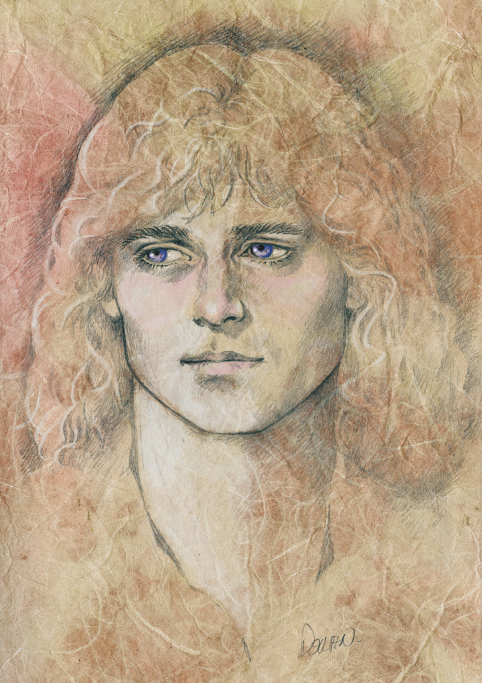
This is the first time this has been published. This portrait of Seren is based on a pen and ink drawing I did way back in 1989.
I wanted to practice my digital painting skills, so decided to give this a try. It took about a day to redo this work from scratch! While some of the snowflakes are mine, others are from a Photoshop set by Meldir, which you can download for free from here.
I didn’t intend to go quite this far when coloring the piece! I thought I would just do comic book style colors, but I just kept going!
It’s also great to have some time to work on A DISTANT SOIL again, and next year is looking better in terms of getting the book back on track, too. But I hope you enjoy this new piece in the meantime.
For everyone who has been waiting for the donation incentive print, the embarrassing truth is when I saved the files in progress, I saved the entire file at a low resolution, too low to print! I couldn’t figure out why we got such bad printing on our first run of prints. That means I am in the process of redoing the painting from scratch. I can’t believe how many times I have made this mistake, at least a dozen key A DISTANT SOIL digital pieces are going to have to be redone or scrapped. They are only good for showing on the web.
At least I’m a better digital painter than I was over a year ago, so it will definitely look better than the first go-round.
And everyone who ordered it will also get a smaller print of this piece!
Have a wonderful holiday! Merry Christmas!
7 Comments
Colleen
I meant this to go up yesterday, but I needed to pick at it a bit more. I did not look at the sketch until after I was finished: can’t believe how many changes I made from the original! So strange to go over something I did so many years ago!
Stampers Saverem
Both pieces are quite lovely!
Colleen
Thank you!
Stoirmcriostal
With how long it has been for the donation drive (which I have no difficulties at all with, honest) my shipping address is about to change. What would be the best way to update the shipping address for the print?
Colleen Doran
Thanks so much! Just pop me an email via the contact form! And thanks for your patience.
I had to eat some crow with my printer, after scolding them about the bad printing. Then I checked my master file…
Stoirmcriostal
I’ve got to admit, I’ve always loved your b&w’s and there’s a different type of moodiness to the original than the colour. They are both amazing, but he’s more haunted in the b&w vs wistful in the colour.
Colleen
It was interesting working on it, because I did the painting on the face on the top layer. The original line drawing was too harsh for the painting technique I wanted to try. And naturally, after I got started, I was basically making a new face, and could not see what I had done in the pen and ink layer while I worked on it. The eyes and jawline are skewed in the original drawing, which is another reason I wanted to tweak it.
The new face is closer to what Seren is supposed to look like, but I had no idea I’d changed the expression so much when I was finished until I put the two side by side to compare!